A landing page is not just another webpage, but rather your “land” of opportunities. Just imagine the wonders that could happen to your lead generation strategy, if you could reduce the bounce rate and get the visitors to fill out your contact form seamlessly.
Or, what if you could win over the dissatisfied customers of your competitors within a few clicks? Sounds like a goldmine? It is.

Best practices to generate quality leads with high-converting landing pages
As per Forbes, B2B customers do not want to contact sales reps till they cover 70% of the sales journey. This goes to show how crucial your digital touch point like landing page is!
Newsflash. There’s no perfect template for crafting a high-conversion landing page. However, certain practices can help you boost your conversions to get the most out of your PPC campaign. Let’s understand them with the help of an example.
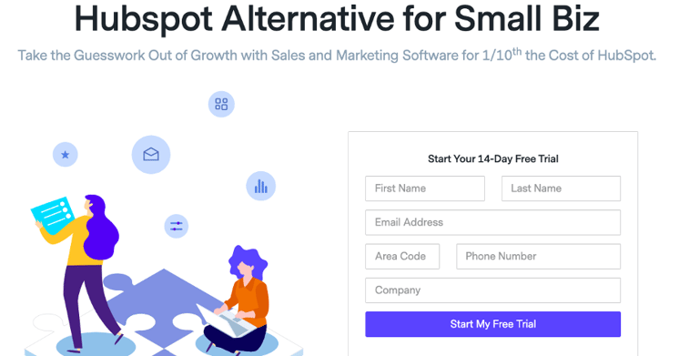
Consider the case of a user who is searching for an alternative to Hubspot. He/she uses the keyword - ‘Hubspot alternative’ - reflecting the search intent. What would be the perfect anatomy of a competitor landing page that targets this search intent? Here’s a look at the prime elements:
Contextual Copy
While a blend of your keyword research and industry knowledge can tell you why customers are looking for alternatives, the next step is to introduce these keyword phrases strategically on your landing page. For instance, if you have created a paid campaign around the keyword “competitor name+alternatives” or “competitor+review”, support it with a contextual landing page copy.
Actionable tips for developing a hard-hitting, targeted copy:
- Make the headline and tagline punchy. Run A/B tests and look at heat maps to see the engagement levels.
- Include statistics that compel - the number of business hours saved, the percentage increase in deals closed, etc.
- Include the pricing upfront with a transparent break-up.
- Use dynamic content to personalize your content to the customer’s location or keyword. For example, “competitor name+alternative+UK” can direct the user to a landing page with more relevant content, boosting conversions.
Comparison Grid
A powerful sales tactic, the comparison grid should take a prime position on the landing page. Showcasing a comparison table with the competition’s features next to your solution’s features gives you instant authority. I like how ActiveCampaign uses this strategy.
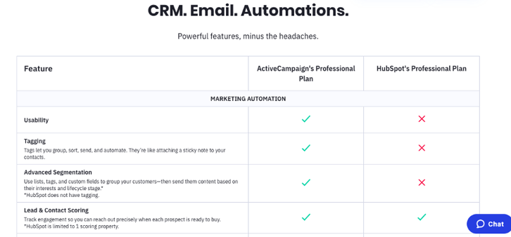
Elements to add to the comparison grid:
- Features
- Target Verticals
- Benefits
- Integrations
- User experience (UI/UX)
- Customer support
- Discounts/ Freebies
Strong call to action
Prospects with a given search intent that visit a relevant landing page are in a prime position to convert. Your call to action should appeal to their impulse and make it easy for them to take the next step. For digital companies, CTAs can typically be:
- Take a webinar
- Schedule a demo
- Call your sales team
But that’s not all. Even the positioning of your CTA is critical. Your best bet is to place the CTA above the fold for both web and mobile visitors. It can also be repeated several times on the landing page, such as:
- On top of the page
- In each section
- At the bottom of the page

Targeted messaging
When you build a landing page, you are trying to solve a niche problem for a specific audience. This becomes the perfect game plan to display how well you understand your clients and their pain points. Ontraport makes compelling use of this strategy on its landing page:
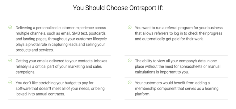
If you plan to use this, call attention to:
- Your target segment - Startups, SMBs, Enterprises...
- The industry segment - Retail, Hospitality, Travel...
- Pain points - Budgets, Lack of customer support, Unfriendly dashboards...
Page design
You may notice that many of these landing pages are quite different from their parent websites. That is because you have more freedom with them, both in terms of the “look & feel” as well as the text. It is a great opportunity to use this to your advantage by keeping things clutter-free and to the point.
How to design a competitor-focused landing page:
- Have a single goal in mind - lead generation. Do not add any distracting elements.
- To ensure that the maximum number of leads are captured, place the lead generation form as close to the fold as possible.
- Instead of animations (which can be distracting), use icons and typography to add visually pleasing elements to the landing page.
Notice how HatchBuck uses these in their campaign.
And further, as it’s said, cleanliness is next to Godliness. In the case of LP, at least we can say, that cleanliness is next to CTA. 😋
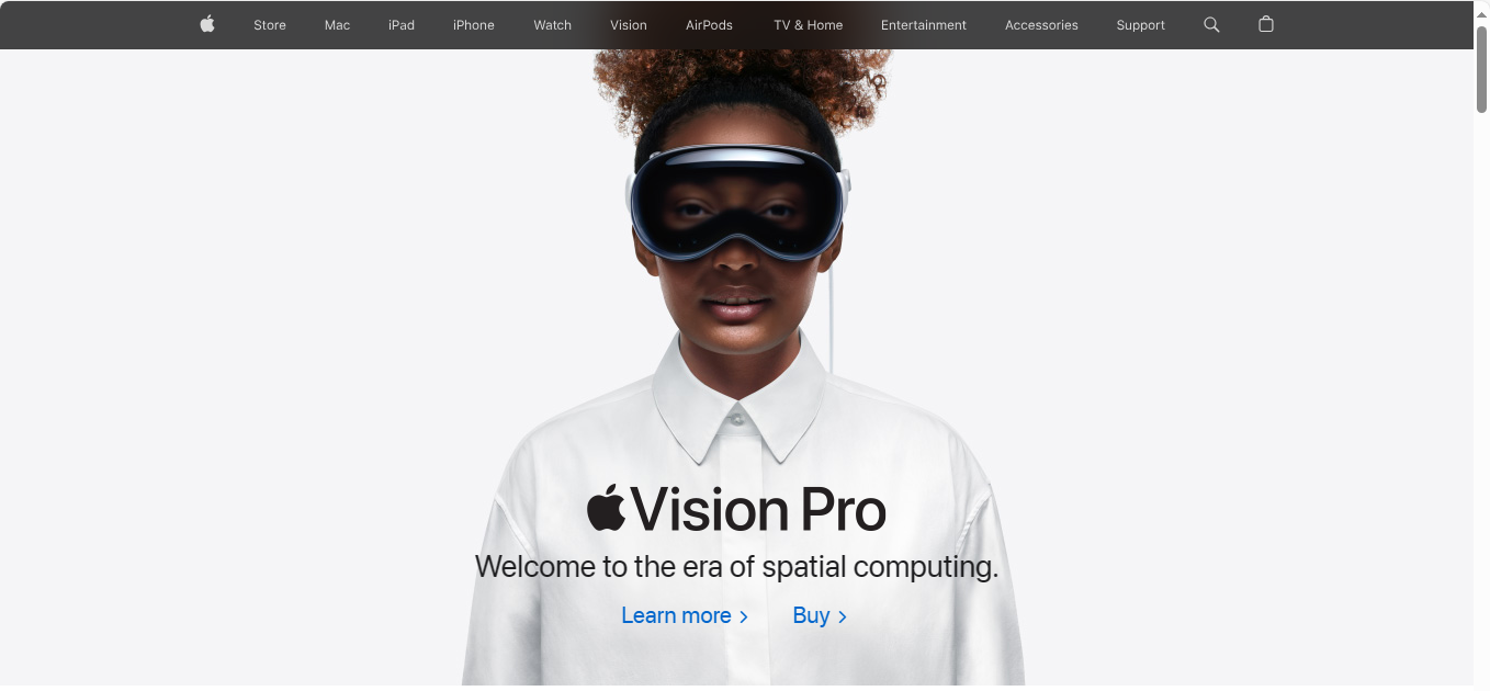
The more advanced the content creators and designers become, the more they appreciate the neat and minimalist approach to a landing page. And there is a good reason for that; the neat interface increases the likelihood of visitors staying on your landing page.
Talking about keeping things simple, it’s hard to look beyond Apple.
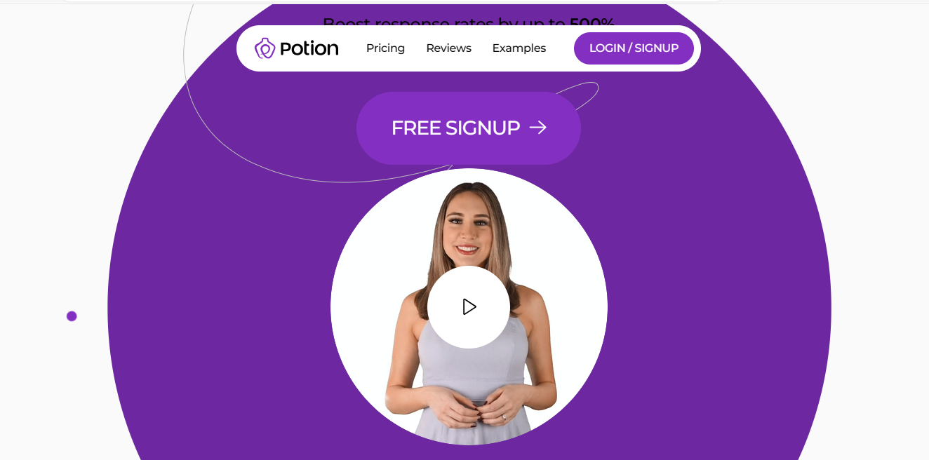
Embedding video to your landing page
You might have heard that the year 2024 is the year of videos, and the story of landing pages is no different. After all, 86% of video marketer say that video has directed traffic to their website.
The video being utilized to convey the message on your landing page should be precise and yet capable enough to capture the essence of your core idea or the product and service that’s your unique selling proposition.
Also, consider embedding the contact form near your landing page video, which can capture those engaging with your content.
Potion, which helps to generate personalized videos at scale using video prospecting, incorporates this exact idea on its homepage.
Using a geo-targeted landing page to capture the most relevant leads
Utilizing location should be a crucial part of your marketing strategy. Be it segmentation or targeting, it always comes in handy.
Geo-targeted landing pages deploy keywords relevant to your target location(s). For instance, a food blogger while writing a piece of content on the top restaurants in Newyork would geo-target the keyword phrase “top restaurants in Newyork”, rather than just “top restaurants.”
In fact, a single ad campaign and a single landing page can be used to target thousands of locations. For this, the specific keywords in the Google Ads can be combined with the dynamic text replacement, based on the UTM values specified in your URL.
Furthermore, dynamic keyword insertion (DKI) is more important than you may think. As per Zapier, when geo-targeting is done without DKI, the click-through rate increases by 29% as compared to a generic campaign. When the same is done with DKI, the click-through rate increases by a whopping 71%.
Removing navigation from the landing page
The main purpose behind removing the navigation is to prevent the visitor from getting distracted while considering filling out your form.
In a HubSpot A/B test, they found that removing their navigation increased the conversion rate.
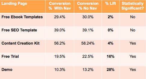
However, it’s easier said than done, as only 16% of all landing pages exist without a navigation bar. And to do away with navigation, you will have to compromise on certain aspects of your strategy.
Yet, removing the navigation is highly recommended, as Yuppiechef’s (an online retailer of kitchen and homeware products) conversion rate increased by 100% as a result of that.
Using the same idea, Career Point College increased its conversion rate by 336%.
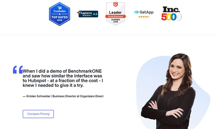
Trust factor
If you have adopted a conservative approach of not mentioning your competitor so far, consider this as an ethical option. Add a client testimonial where they bring up your competitor instead of you - it’s far more effective (and suave)!
Here’s how to build trust on your landing page:
- Showcase a client testimonial that reinforces your competitive advantage.
- Include subtle bragging rights with independent audit ratings, media reviews, or industry awards.
Going back to HatchBuck’s case, they pretty much hit the home run in this regard.
Closing the deal
Along with the reasons to choose you over your competitors, your landing page should answer any doubts that can potentially counter the leap of faith of customers.
Consider adding these elements to the page:
- A quick tour of your solution
- Free trials and videos
- Webinars and ebooks
- Frequently Asked Questions (FAQs)
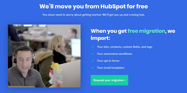
Interestingly, ‘Migration Assistance’ can also be a powerful motivator. It reassures prospects about making the switch and also showcases your respect for their business uptime. Case in point: ActiveCampaign.
Looking Forward
Competitor landing pages are lighthouses that your digital business needs, guiding potential customers into your bay. By blending with expert digital marketing tactics, these pages can potentially deliver high conversions and impressive ROIs.
At Fractional CMO, our RevOps experts will help you plan your entire competitor-focused landing page campaign so that you nail your revenue operations goals like never before.