Landing pages are effective when it comes to generating leads for a business.
Considering that the B2B sales cycle is longer than B2C, customers need a lot of soft nudges to take them to the next stage of the customer lifecycle.
A B2B landing page can be a good way to begin.
According to HubSpot’s State of Inbound Marketing 2018 report, companies saw a 55% increase in leads by using landing pages.
So, what are landing pages, and how are they different from the usual home pages?
HubSpot defines landing pages as a web page that captures prospects’ information through a lead capture form. It allows you to target your audience, offer them something valuable, and convert them into leads.
Perhaps you might be wondering why you need a landing page if you have a website already.
Well, let’s take an example. Imagine you are looking for some specific information, such as how to create high-lead conversion landing pages. You click on the first link on the search page result. You land on the homepage of that website. It has all the information about the company, its services, etc. But there is no sight of any content related to creating land pages.
What will you do? If I were you, I would just exit the website.
When you write on a specific topic and optimize it for paid ads, you need to have a corresponding landing page that talks about that specific topic.
Unlike a website, it has to be specific, offer information about the offering, and have a call to action (CTA) button such as one to download a resource or a form to capture the details of the prospect.
They can share the same domain as your website, but the content and the layout should be different from the other pages.
There are various tools that you can use to create high-converting landing pages. However, a good landing page goes beyond that. It is about the way you write and present it that matters.
Let’s look at how some B2B companies got it right.
HubSpot
Here’s what we like about the HubSpot landing pages:
- They set the expectations right on what the readers will gain from their offering.
- They give a preview of what you will gain.
- Contains FAQs to help you determine if it’s worth clicking on the CTA button.
![HubSpot_LP[1]](https://blog.fractionalcmo.io/hs-fs/hubfs/HubSpot_LP%5B1%5D.png?width=684&name=HubSpot_LP%5B1%5D.png) When you build a landing page, ensure that your copy clearly tells the prospects what they can expect from your offering. A preview will give them a better sense of what they can expect, while an FAQ section will address their queries and help them make an informed decision.
When you build a landing page, ensure that your copy clearly tells the prospects what they can expect from your offering. A preview will give them a better sense of what they can expect, while an FAQ section will address their queries and help them make an informed decision.
Salesforce
Here’s what we like about Salesforce’s landing page:
- They present the data upfront in a copy that appeals to the human analytic mind.
- The video on the landing page gives you an idea of what they can expect after clicking on the CTA.
- The lead capture form is right on the top of the page, saving you from scrolling down the page.
- They have a customer testimonial below the video that can boost the prospect’s confidence to click on the CTA button.
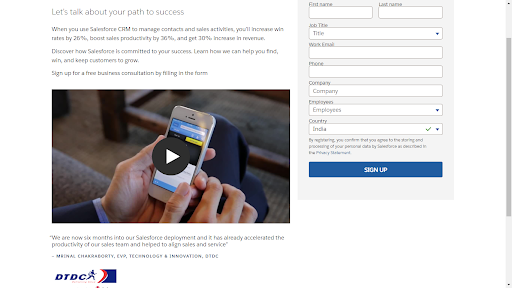
While building a landing page, ensure that you add customer testimonials on the page. Using data to back your claims and a genuine customer testimonial will boost your prospect’s confidence to try your offering. Adding a form on the top will ensure that your prospect does not miss taking action.
PayScale
What we like about PayScale’s landing page:
- Unlike many other landing pages, PayScale’s landing page is interactive. This helps in keeping the prospect invested in the landing page. For instance, it asks you to provide some details related to your job role to get solutions and content related to your compensation.
- As you scroll down, you find case studies and blogs related to the theme of the landing page.
![PayScale[1]](https://blog.fractionalcmo.io/hs-fs/hubfs/PayScale%5B1%5D.png?width=504&name=PayScale%5B1%5D.png)
If your offerings are not niche and cater to different customers, and if you want to personalize the offerings for each segment of customers, then create an interactive landing page. This will help you to reduce the exit rate and keep the prospects interested in your solutions.
Vibe
Here’s what we liked about Vibe’s landing page.
- The hero images are presented in a carousel format, each having a different call to actions and copies.
- As you scroll down, you will find the links to their products.
- At the end of the page, they have a video relevant to the landing page’s theme and display customer stories.
![Vibe[1]](https://blog.fractionalcmo.io/hs-fs/hubfs/Vibe%5B1%5D.png?width=502&name=Vibe%5B1%5D.png)
The hero section is the most important one of a landing page. It’s your canvas to highlight your offerings and achievements and provide links to your most important resources.
Drift
Here’s what we like about Drift’s landing page:
- They have a chatbot that asks specific questions relevant to the theme of the landing page. This makes it easier for the prospect to get clarity on what they can expect from the page.
- As you scroll down, you will find a video about the product.
- Apart from the customer testimonials and features, the landing page also provides insight into how prospects can use their products to achieve their marketing goals.
![Drfit[1]](https://blog.fractionalcmo.io/hs-fs/hubfs/Drfit%5B1%5D.png?width=505&name=Drfit%5B1%5D.png)
Prospects may prefer to read more about the product or have their queries addressed before filling out the lead capture form. A chatbot could help your customers to get solutions to their queries in real time. You can also consider adding videos to the page to provide deeper insights into your products, which may not be possible through text. Providing ideas on how the user can use your product will help them to make a more informed purchase decision.
Zoho
Here’s what we like about Zoho’s landing page:
- The landing page has the contact form right at the beginning to ensure that the prospect does not miss it.
- They begin the copy with an attractive heading and establish authority by mentioning the number of customers served and their position as a marketing leader.
- As you scroll down, you will find the benefits of their product presented in an intuitive manner. It also updates the numbers such as conversion rate, and decrease in marketing costs in real-time.
- The landing page further talks about the features of the product.
- At the end of the page, it establishes its reputation by mentioning the ratings received from reviews and by adding customer testimonials.
![Zoho[1]](https://blog.fractionalcmo.io/hs-fs/hubfs/Zoho%5B1%5D.png?width=1348&name=Zoho%5B1%5D.png)
Adding your experience in the domain and the number of customers you have served will help in establishing your authority. If you have received ratings or awards from institutions or publications, include them on the landing page. It will up your trustworthiness quotient. Add numbers to make the benefits more appealing.
UpWork
Here’s what we like about UpWork’s landing page:
- The message is sharp and clear.
- UpWork has easy navigation and has all the offerings mentioned upfront.
- There is a step-by-step explanation of how UpWork works.
- At the end of the landing page are testimonials from companies who have worked with UpWork before.
![Upwork[1]](https://blog.fractionalcmo.io/hs-fs/hubfs/Upwork%5B1%5D.png?width=502&name=Upwork%5B1%5D.png)
If your offering can be explained in a step-by-step format, use the UpWork’s process of explaining it to the prospects. Also, ensure that your offerings are explained upfront to the prospects, so they know what’s in store for them.
Unbounce
Here’s what we like about Unbounce’s landing page:
- Unbounce begins with a short and straightforward copy at the beginning, followed by a call to action button.
- The second call to action takes the prospects to the payment page.
- They use large fonts and intuitive graphics to highlight their benefits.
- They have customer testimonials at the end of the page.
![Unbounce[1]](https://blog.fractionalcmo.io/hs-fs/hubfs/Unbounce%5B1%5D.png?width=504&name=Unbounce%5B1%5D.png)
To build a landing page like Unbounce, write a short and direct copy, use bold fonts and add CTAs at strategic places to ensure that it does not look intrusive but at the same time looks unmissable.
Slack
Here’s what we like about Slack’s landing page:
- It has a short and well-explained description of Slack, followed by a simple email box, which could save the user time.
- It is followed by logos of companies using Slack.
- At the end of the landing page are stories of customers who use Slack.
- The benefits leverage videos and screenshots to give the user an idea of how Slack works.
![Slack[1]](https://blog.fractionalcmo.io/hs-fs/hubfs/Slack%5B1%5D.png?width=504&name=Slack%5B1%5D.png)
If you have some interesting customer stories to share, ensure that you include them on your landing page. You can also add screenshots and videos of your products against the benefits to give the users an idea of how the product looks.
Instapage
Here’s what we like about Instapage’s landing page:
- The landing page begins with a claim on how Instapage’s personalized landing pages can lead to a 400% increase in conversions followed by two CTA options.
- As you scroll down, you will find the list of products available, which takes you to the dedicated landing page.
- At the end of the landing page are links to their customers’ success stories and resources relevant to the theme of the landing page.
![Instapage[1]](https://blog.fractionalcmo.io/hs-fs/hubfs/Instapage%5B1%5D.png?width=504&name=Instapage%5B1%5D.png)
People trust numbers. So, if your offering has provided a quantifiable result, start your copy with it to attract the attention of the prospect. Apart from adding the benefits and customer testimonials, you can also provide links to resources relevant to the theme such as, blogs, webinars, etc.
Try our free checklist for creating high-performing and winnings B2B landing pages.
.jpg?width=790&height=103&name=10%20Inspiring%20B2B%20Landing%20Pages%20-%20Blog%20Banner%20(1).jpg)
We hope this blog helps you to create high-conversion landing pages. Need help in creating landing pages or with your digital marketing campaign? We are just a click away.